Reporting, Digitalisation & Rollouts
From Inventory Data to Dynamic Store Ranking
A data-driven evaluation model that makes stores with different sales areas, revenues and shrinkage levels comparable.
Shrinkage figures alone do not show how a store compares to other locations. Different sales areas, revenues and store structures make a direct comparison difficult.
From this question, I developed a dynamic ranking model that automatically compares the results of all inventories already completed within a financial year.
The basis was regularly provided controlling and quarterly data. After inserting the latest figures, the evaluation updated automatically and included only those stores whose inventory in the current financial year had already been completed.
With every further inventory, the ranking grew dynamically. Only after the final inventory of the financial year did the complete annual ranking emerge.
Comparing different stores fairly
Simply comparing absolute shrinkage would not be very meaningful. A large, high-revenue store will naturally show a higher absolute shrinkage than a small location.
Conversely, a small store may be far more conspicuous in relation to its sales or sales area, despite a lower absolute loss.
The goal was therefore an evaluation logic that combines several perspectives and thereby enables a more differentiated assessment of the stores.
Several KPIs instead of a single figure
The ranking combined four central evaluation categories:
1. Shrinkage in %
Evaluation of shrinkage in relation to sales.
2. Shrinkage in €
Absolute shrinkage measured on a cost-price basis.
3. Shrinkage per m²
Shrinkage in relation to the weighted sales area.
4. Net sales per m²
Sales performance in relation to the weighted sales area.
In addition, the different area types of the stores were taken into account. This made it possible to compare stores of different sizes and structures in a far more differentiated way.
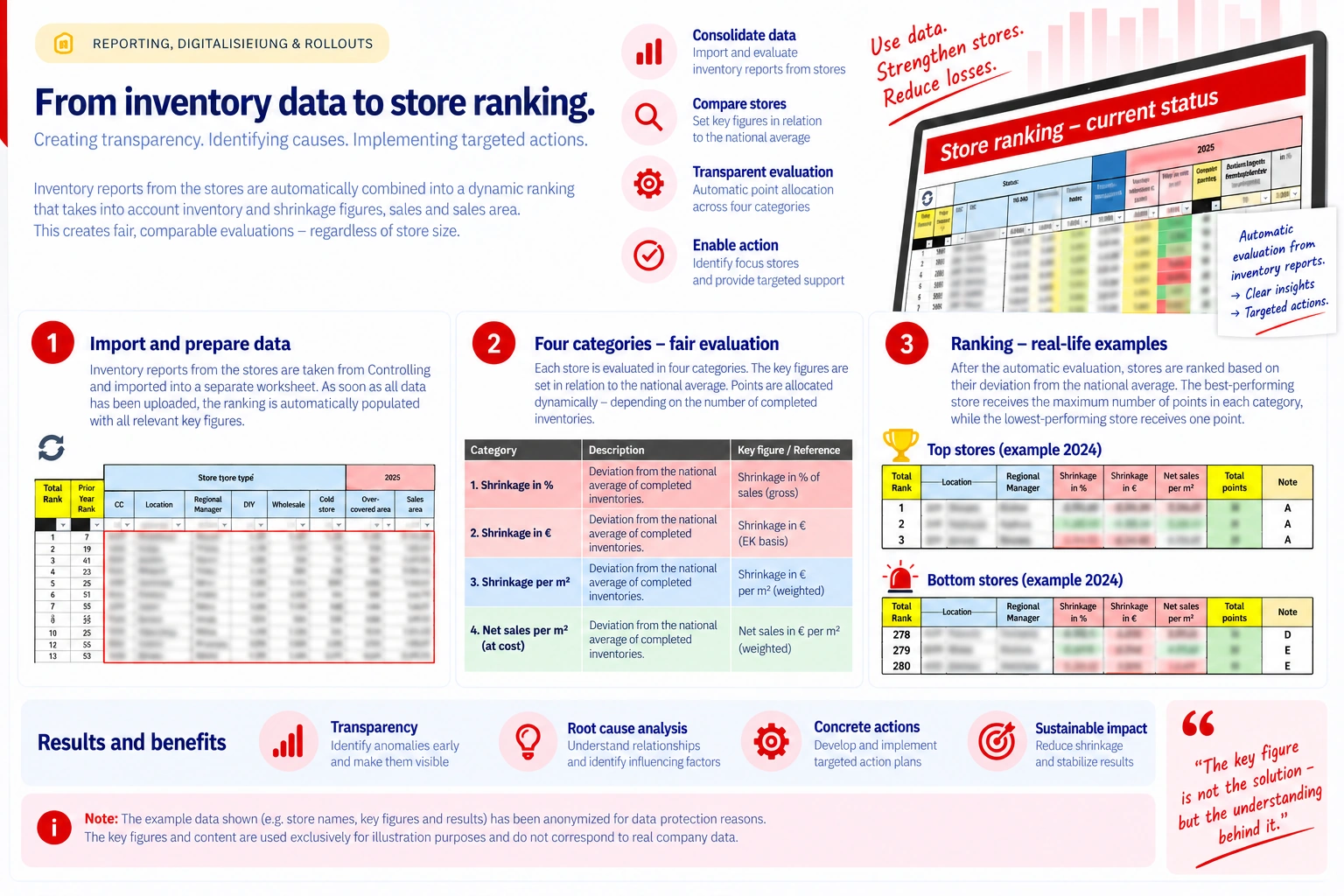
Overview of the approach: importing data, evaluating four categories and deriving a dynamic ranking. Sensitive data has deliberately been made unreadable.
The benchmark evolved with every inventory
A special feature of the model was the dynamic calculation of the national average.
At the beginning of the financial year, the comparison group consisted only of the stores whose inventory had already been completed.
Whenever another inventory was added, the average values were recalculated automatically. As a result, the benchmark itself changed over the course of the year.
The ranking was therefore not a static snapshot, but evolved with the actual inventory progress of the financial year.
Turning KPIs into a transparent ranking
For each of the four categories, the model determined how strongly a store deviated from the current national average.
The stores were then scored within each category according to their results. The maximum achievable score per category corresponded to the number of inventories completed at that point in time.
For example: with 18 inventories completed, the best store in a category could receive a maximum of 18 points. Once 51 inventories had been completed, the maximum rose to 51 points. The weakest store received one point.
The points from the four categories were then added up to a total score, which automatically produced the overall ranking — the higher the total, the better the placement.
Development instead of an isolated snapshot
Alongside the current overall rank, the previous year's placement was also shown.
This made it possible to see how a store had developed compared to the previous financial year.
The ranking could therefore not only highlight current anomalies, but also make positive or negative developments of individual locations visible.
From a ranking to a steering instrument
The goal was not simply to produce a list of good and bad stores.
Rather, the model was intended to make anomalies visible and to identify stores where a more in-depth root cause analysis or operational support could be worthwhile.
In particular, the combination of percentage shrinkage, absolute shrinkage, sales area and revenue also brought smaller locations into view — stores that might not have stood out in a purely absolute comparison.
This created a data-driven basis for prioritising stores and for deriving further analyses and actions in a targeted way.
New data in — updated ranking out
The evaluation was built so that new controlling and quarterly data could be pasted into a separate worksheet.
The relevant KPIs, reference values, points and placements then updated automatically.
As a result, the same logic could be reused throughout the entire financial year without rebuilding the ranking manually after every new inventory.
Results & added value
Transparency
Making different store structures and shrinkage levels comparable.
Dynamic benchmark
The reference value evolves automatically with every completed inventory.
Prioritisation
Identifying conspicuous stores on a data basis and supporting them in a targeted way.
Automation
Insert new data and the ranking updates automatically.
“A ranking is valuable when it does not just assign places, but shows where a closer look is needed.”
Putting the project in context
I initially developed the model as an approach for a nationwide ranking. Parts of the underlying ranking and evaluation logic were used in my own region and occasionally in further regions.
This case study illustrates the approach as an example of the way I work and of my analytical and development skills.
Focus areas
More case studies